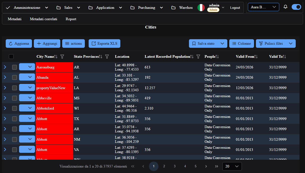
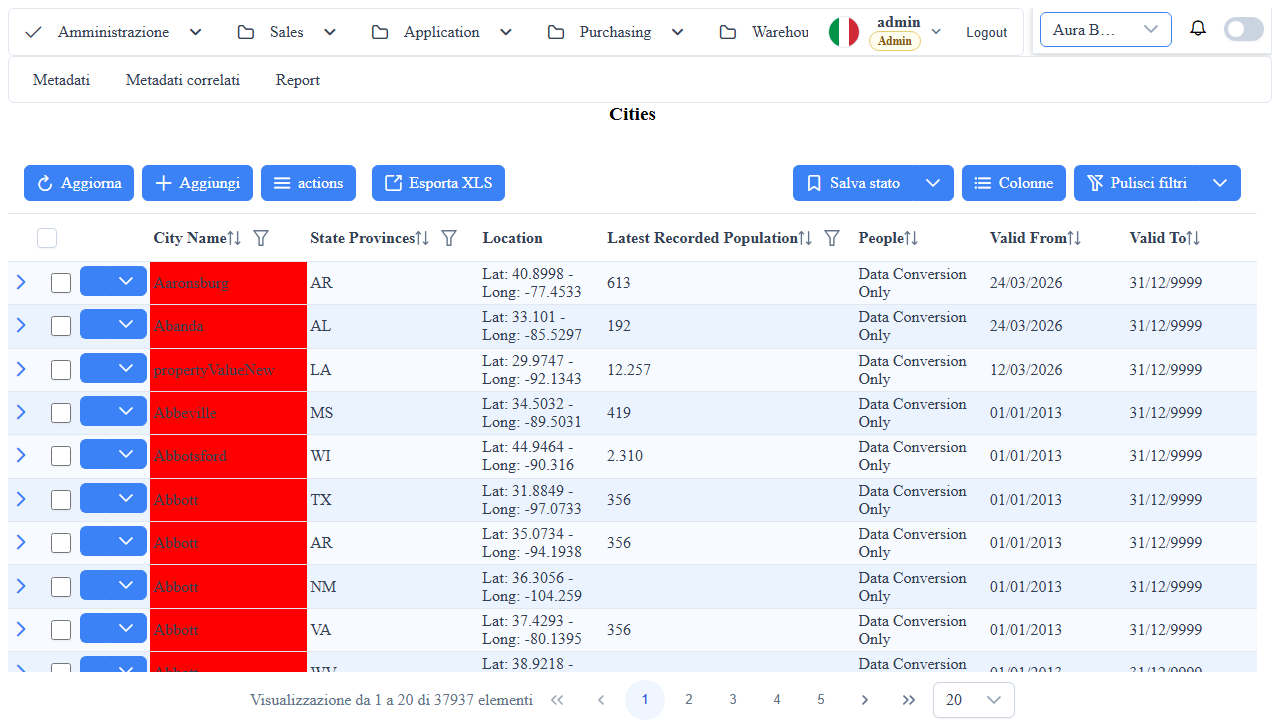
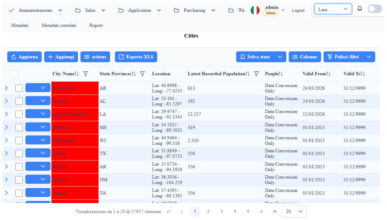
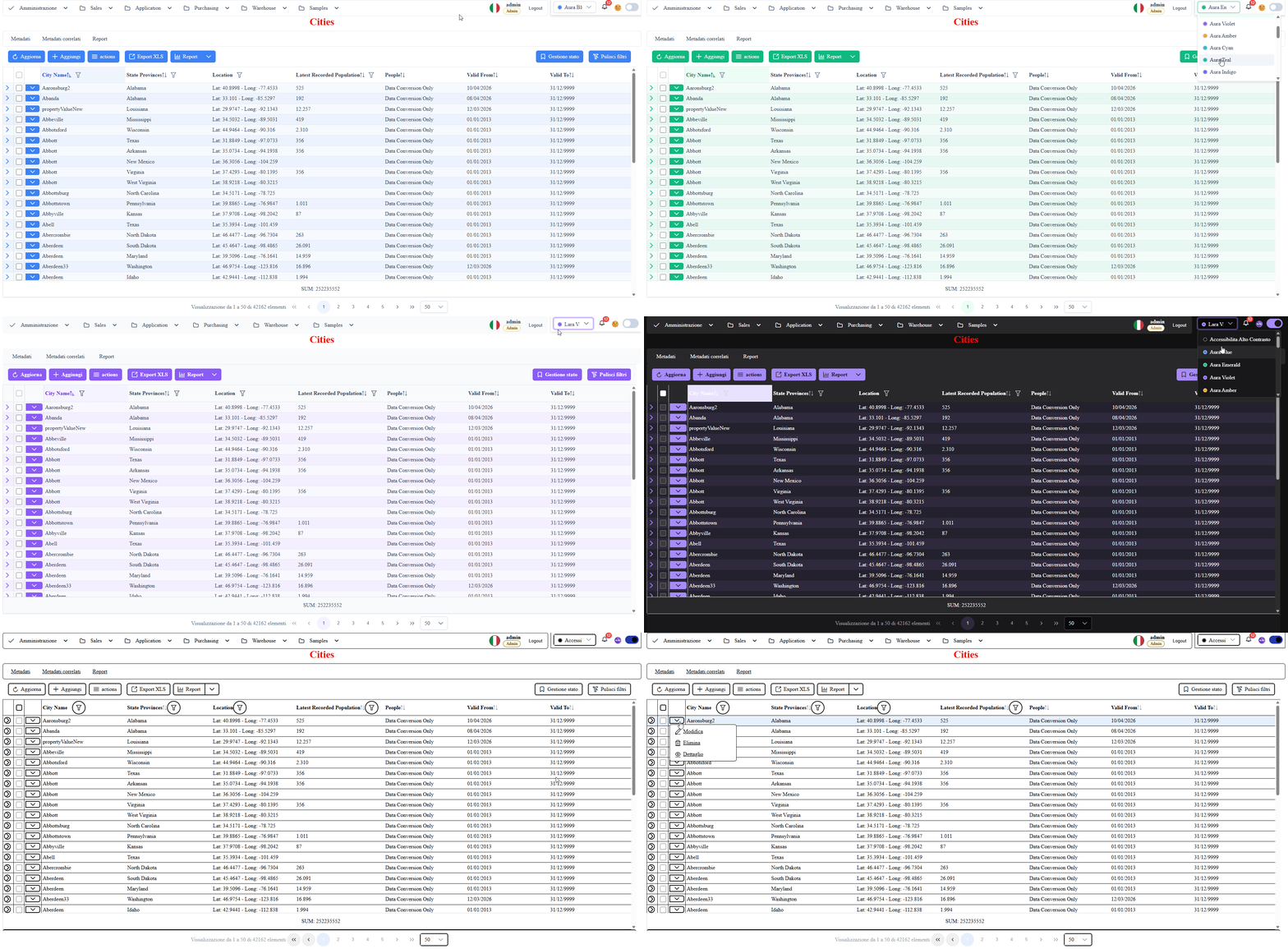
Overview
PrimeNG + Dark Themes
This section documents the framework's theming strategy based on PrimeNG and integrated dark mode.
Objectives
- Visual consistency between PrimeNG components and custom WUIC components
- Immediate theme switching without page reload
- Desktop and mobile compatibility
What It Includes
- Light/dark theme palette
- Shared color tokens in the docs/framework layer
- Theme persistence support in localStorage
Available Themes Catalog
- The complete list of supported themes is dynamically rendered below from the shared runtime catalog.
- Each theme shows its name and primary color (circular swatch based on shade
500). - The list is 1:1 aligned with the themes selectable from the dropdown in the application header.
Best Practices
- Avoid unnecessary global overrides
- Prefer CSS variables and centralized tokens
- Always validate contrast and readability in dark mode
Screenshot