Overview
Accessibility
A11y features used in dynamic fields of the parametric-dialog, without impacting the current visual layout.
Scope
- Fields dynamically rendered via
wuic-field-editor/wuic-field-filter. - Label-control association for native widgets and PrimeNG widgets.
- Consistent keyboard navigation via
tabIndexcalculated based on field order.
Advanced
Accessibility
For the dynamic form fields (parametric-dialog), the framework applies these rules:
for=""on labels only when the target control is actually associable (avoids browser warnings on orphan labels).- Semantic fallback: when
foris not reliable,aria-labelledbyis used on the inner input control. - Stable label
id(<field.ang_name>__label) used as A11y reference for complex widgets (p-autoComplete,p-select). - Runtime application of
aria-labelledbyalso after async re-render of PrimeNG widgets. - Dynamic
tabIndexpropagated to field widgets based on field order in the form. tabIndexextended also toparametric-dialogtoolbar buttons (isEditForm=true) after the last editable field.
High Contrast Theme
A high contrast theme variant is also available, selectable from the theme dropdown (High Contrast Accessibility).
- Activates the global class
theme-high-contrastonhtml/body. - Maintains the current layout (no component structure changes), intervening only on color tokens, borders, and focus ring.
- Increases foreground/background contrast and makes control borders more visible.
- Applies reinforced visible focus (
outlinewith high contrast) for keyboard navigation. - Maintains compatibility with PrimeNG presets already in use (base
aura+ A11y override).
Reference regulatory targets (Italy/EU):
- WCAG 2.1 level AA (contrast criteria, visible focus, and keyboard navigation).
- EN 301 549 (European standard for ICT accessibility in the public sector).
- Law 4/2004 "Stanca Law" and AGID guidelines (Italian public administration context).
Visual examples (gallery "Feature screenshots"):
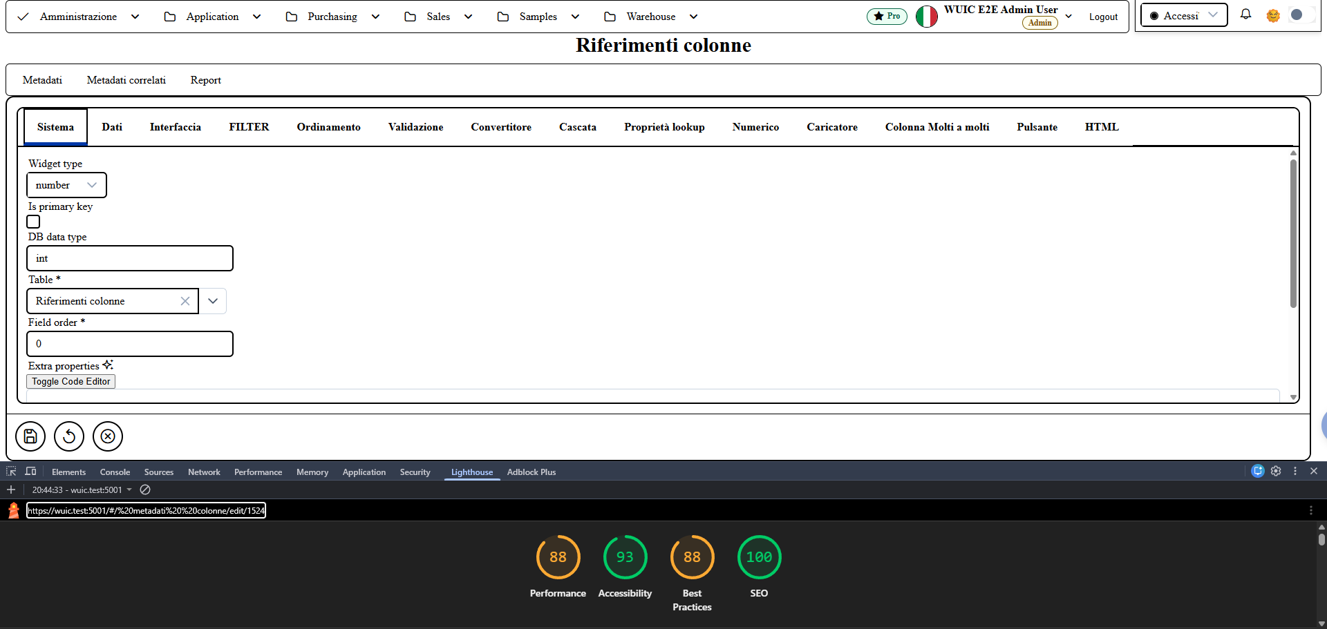
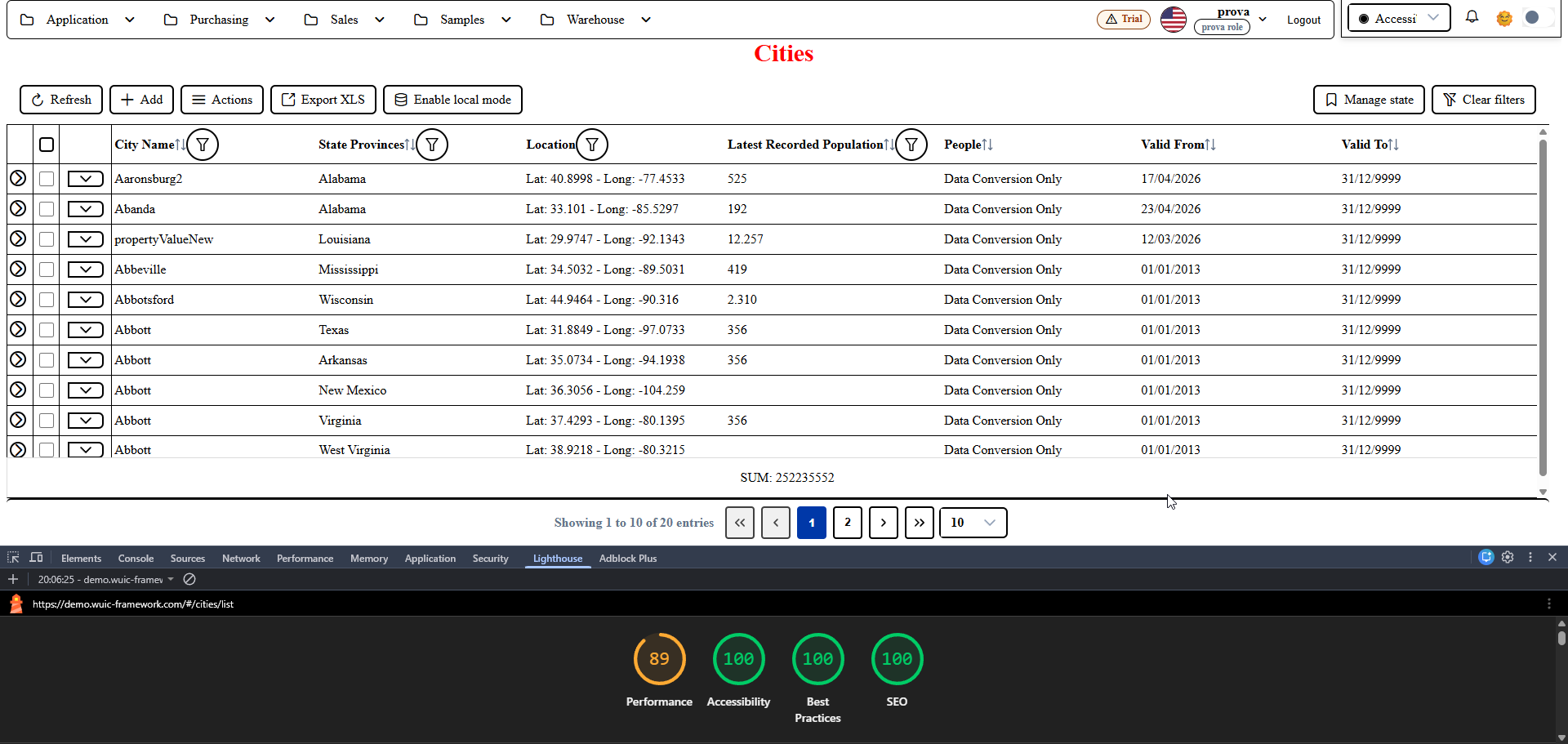
manual-accessibilita-01- metadata edit form in high contrast theme:parametric-dialogtabs with 2px black borders, active tab indicator--hc-accentblue (#0038a8), contrasted focus ring, Lighthouse Accessibility audit 93.manual-accessibilita-02- list-grid in high contrast theme: table header, rows and filter controls with WCAG palette (bg#ffffff, fg#000000, borders--hc-border), Lighthouse Accessibility audit 100.
Operational Notes
- No CSS layout changes required: the interventions are semantic/accessibility-first.
- In case of additional custom widgets, expose
@Input() tabIndexand (if needed)@Input() ariaLabelledBy. - Recommended verification in DevTools > Issues:
- absence of Incorrect use of <label for=...> warning;
- absence of No label associated with a form field warning;
- keyboard focus order consistent with field/button order.
Screenshot