Overview
Responsive Mobile Layout
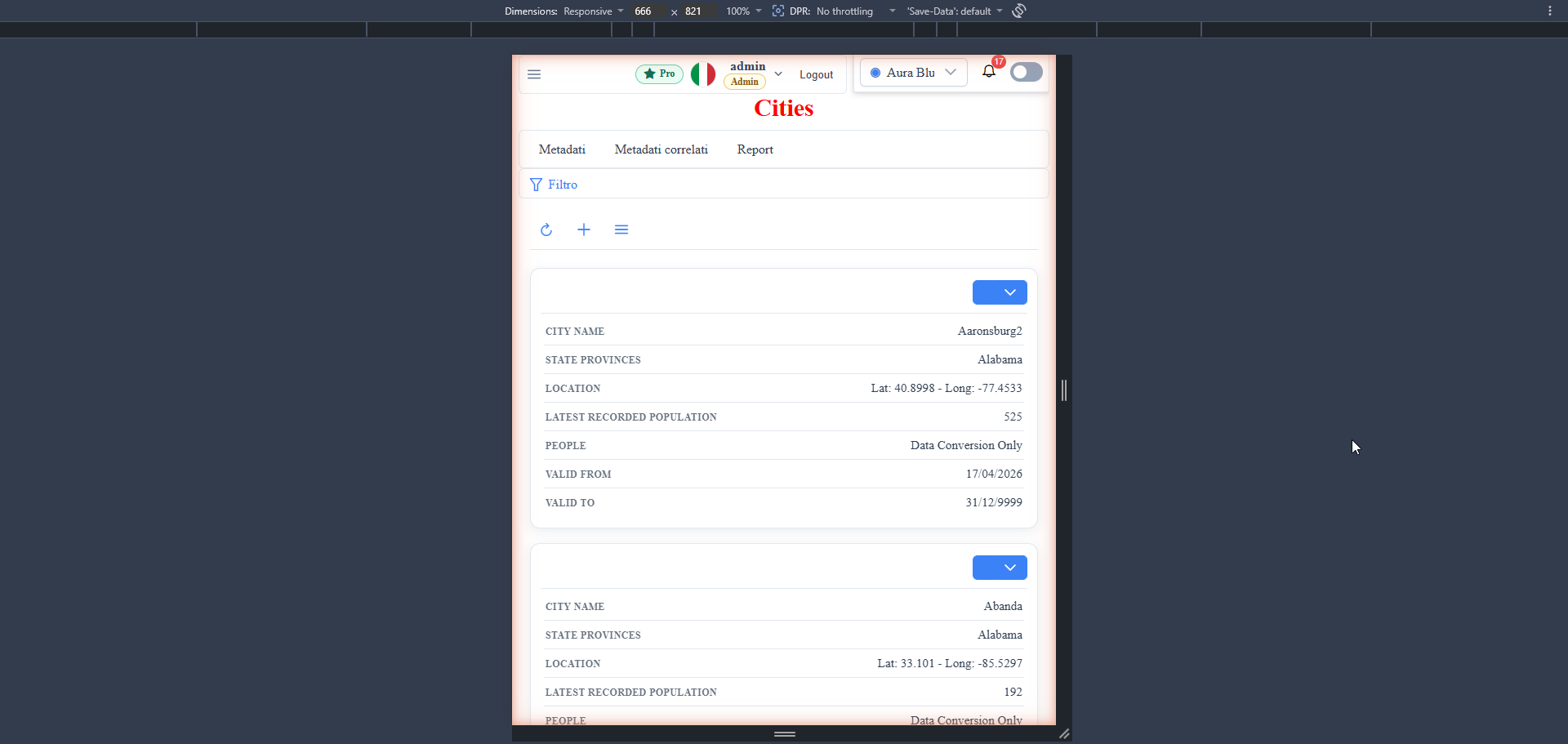
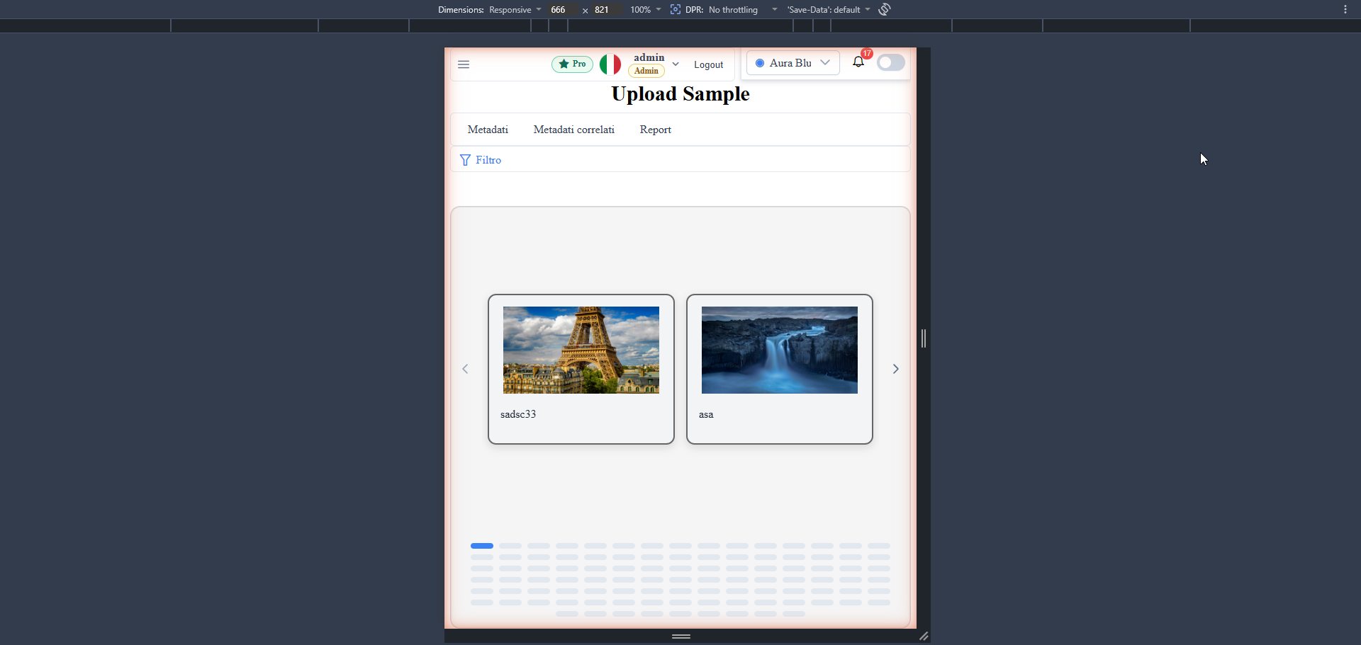
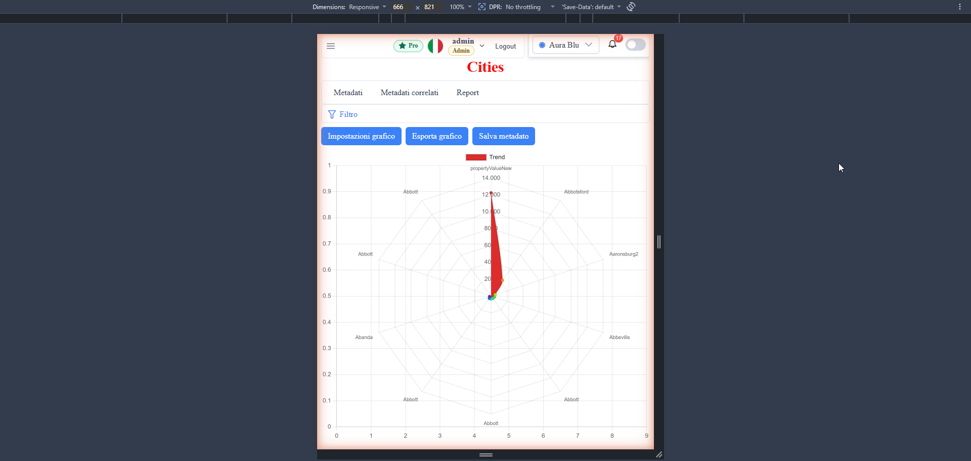
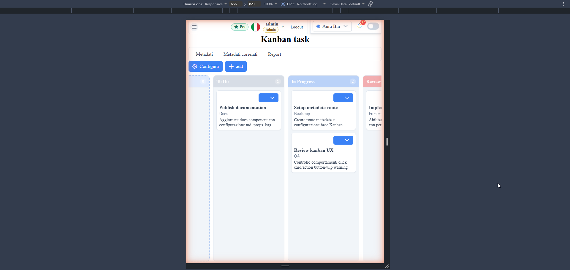
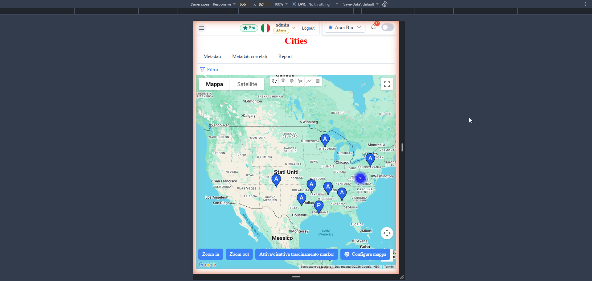
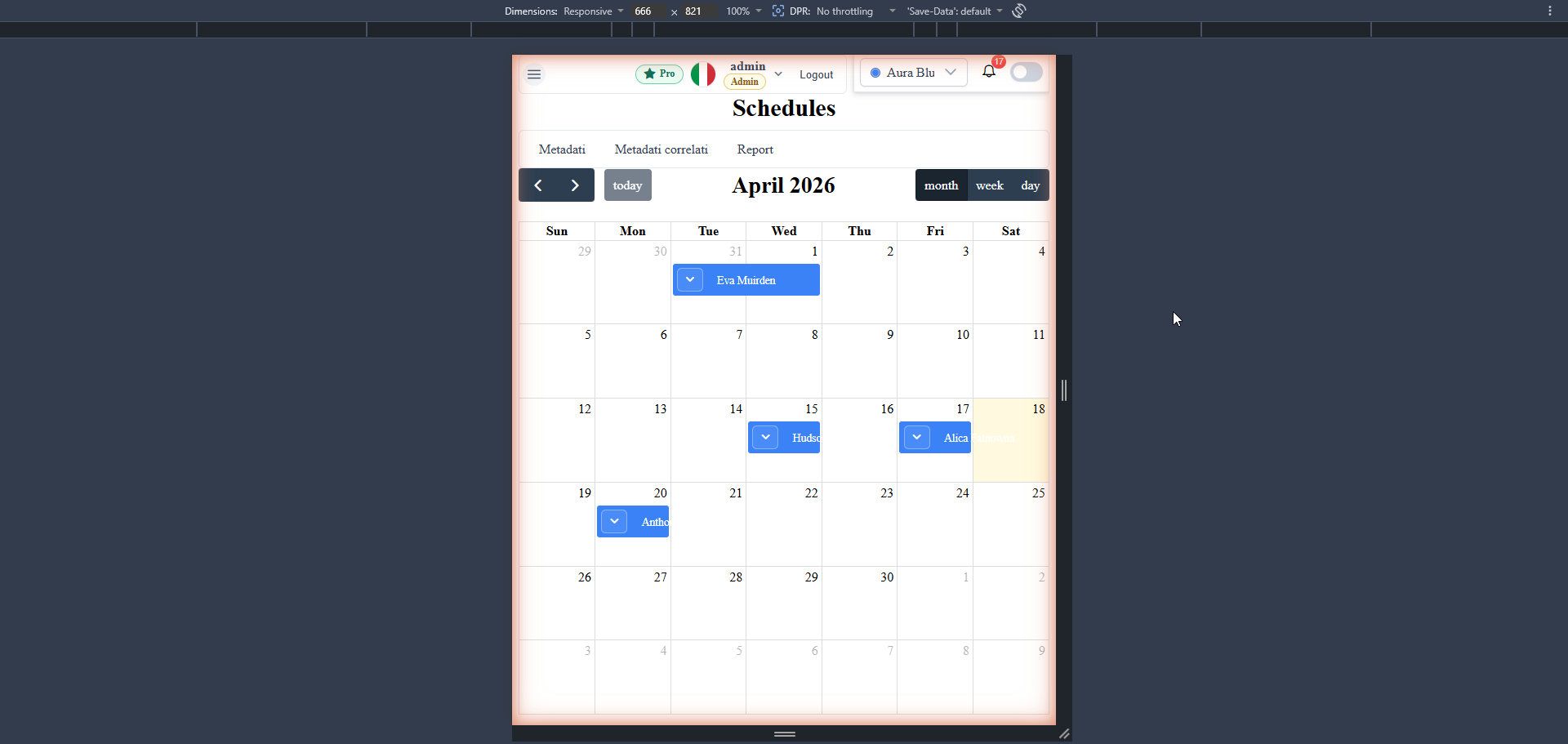
The framework automatically detects the viewport and changes the rendering of the two main components — <wuic-list-grid> and <wuic-parametric-dialog> (edit-form) — on narrow screens, without requiring changes to the application metadata.
What Changes on Mobile
| Component | Desktop (>768px) | Mobile (≤768px) |
|---|---|---|
<wuic-list-grid> | <p-table> with horizontal rows, frozen action column, tabular virtual scroll | Stack of vertical cards (one per record) with caption/value in two columns, action button on top, paginator at the bottom, optional PrimeNG virtual scroller |
<wuic-parametric-dialog> (edit-form) | Fields laid out on one or more columns according to mc_ui_size_width | Full-width fields stacked vertically, horizontally scrollable tab list, compressed toolbar |
The switch is transparent to the application code: no host template to fork, no metadata to set. It reuses all existing metadata rules (mc_hide_in_list, mc_ui_grid_column_data_template, custom action button, conditional styling).
Configurable Threshold
The switch threshold defaults to 768px, aligned with the Bootstrap-like breakpoint. To change it in your host:
// app bootstrap (e.g. main.ts or an APP_INITIALIZER)
import { MetadataProviderService } from 'wuic-framework-lib';
import { environment } from './environments/environment';

MetadataProviderService.widgetDefinition.mobileBreakpointPx =
  environment.mobileBreakpointPx ?? 768;
And in environment.ts:
// src/environments/environment.ts
export const environment = {
  production: false,
  mobileBreakpointPx: 768  // tablet excluded
  // mobileBreakpointPx: 1024  // tablet portrait/landscape included
  // mobileBreakpointPx: 600   // only real smartphones
};
The threshold is read once in the constructor of the DeviceAwarenessService singleton. If you want to change it at runtime, recreate the instance by re-bootstrapping the app (rare use case).
Programmatic Detection
The DeviceAwarenessService singleton exposes:
isMobile$: Observable<boolean>— emits on every viewport transition (based onwindow.matchMedia)isMobile: boolean— synchronous snapshot
Typical usage in a custom component:
import { Component, inject } from '@angular/core';
import { AsyncPipe } from '@angular/common';
import { DeviceAwarenessService } from 'wuic-framework-lib';

@Component({
  selector: 'my-card',
  imports: [AsyncPipe],
Customizing the Mobile Card Template
The default mobile card shows actions + label/value rows. To provide a completely custom template (e.g. avatar + title + sub-info), set WidgetDefinition.mobileCardTemplate with an Angular markup string. The template is compiled at runtime via ɵcompileComponent, so it can use standard directives, pipes, and bindings.
Variables available in the template scope (passed as inputs by <wuic-list-grid> mobile):
rowData— current recordrowIndex— row index (0-based)columns— array[{ field, header, metaColumn, ... }]metaInfo— table meta info (metaInfo.tableMetadata,metaInfo.columnMetadata)datasource—DataSourceComponentinstanceactionButtonRowIsVisible(rowIndex)— boolean for virtualization (alwaystrueif not virtualized)
Example — two-row card with avatar and actions at the bottom:
import { MetadataProviderService } from 'wuic-framework-lib';

MetadataProviderService.widgetDefinition.mobileCardTemplate = `
  <div class="my-mobile-card">
    <div class="my-mobile-card-header">
      <img *ngIf="rowData.avatar_url"
           [src]="rowData.avatar_url"
> Selector note: the template is rendered inside a host element with a custom selector <wuic-mobile-card-host> (not <div>) to avoid infinite loops on NgIf/ViewContainerRef. You don't need to manage it manually — just focus on the inner markup.
> Custom styles should be placed in global CSS (e.g. styles.scss) or in a component with encapsulation: ViewEncapsulation.None, because the card template is compiled into a component separate from the <wuic-list-grid> host. Alternatively, use wuic-mobile-card-* prefixed classes already styled by the library.
Customizing the Mobile Edit-form
The mobile edit-form is CSS-only (no alternative template): the rules under @media (max-width: 768px) in parametric-dialog.component.scss neutralize the inline width of fields and stack them vertically.
If you want a completely different mobile edit-form layout (e.g. multi-step wizard on mobile, single-page on desktop), you can use the existing md_edit_template system:
1. Create an Angular component with the desired markup and register it in the host widget map.
2. Set the md_edit_template column of _metadati__tabelle with the component's selector.
3. <wuic-parametric-dialog> renders it in place of the default generated form.
If you need to change the template only on mobile, use DeviceAwarenessService.isMobile inside the custom component to choose the variant.
Mobile Card Virtual Scroller
When the number of records per page is large, the mobile cards are rendered inside <p-virtualscroller> (selector alias of <p-scroller> PrimeNG 21). The switch is gated by the same isListVirtualizationEnabled() flag used by the desktop <p-table>, so:
- Tables that have
metaInfo.tableMetadata.archetypes.list.virtualize(or page size > 1000) activate virtualization on the mobile version as well. - The item height is estimated by
getMobileCardEstimatedHeight()(heuristic on the number of visible columns + 18px gap), with[autoSize]="true"recomputing after the first render.
Nothing to configure on the app side: the same flag governs both modes.
Automatic Scroll-to-top
On mobile, after a page change from the paginator, the scroll automatically returns to the top of the card list (both the .wuic-mobile-card-list container and window). On desktop the default <p-table> behavior (internal table scroll) is unchanged.
Filter-bar on Mobile
<wuic-filter-bar> automatically changes behavior under the mobile threshold:
| Desktop | Mobile |
|---|---|
| Inline collapsible panel (chevron). The content (5 tabs: Filter / Advanced Filter / Page Size / Sorting / Grouping + form) expands below the toggle, reducing the list area in the same flex container. | Toggle button with pi-filter icon. The content opens in a modal `<p-dialog>` (95vw × 85vh) with dismissableMask, closeOnEscape, "Filter" header, and close button. The list below stays intact (the modal is an overlay) and when the user closes the dialog the app returns directly to the list without jumping to top. |
Synchronized state: mobileDialogVisible ↔ isCollapsed. Nothing to configure on the app side — the switch is transparent.
Architectural rationale: the flex chain .repeater-content > wuic-data-repeater > .data-repeater-body > wuic-list-grid-lazy > :host is all overflow: hidden + max-height: 100%. On narrow viewports, an inline panel that grows vertically squashes the list-grid to 0px, because the scrollable container (.repeater-content) is constrained to the viewport and cannot scroll to reveal the hidden list. The modal avoids the problem by moving the filter-bar out of the layout flow.
Best Practices
- Keep the 768px threshold default if you have no precise needs: it's the most common standard value and already aligned with the breakpoint used by the framework's other
@mediarules. - When trying a custom card template, start from the default
buildDefaultMobileCardTemplate(see list-grid source) and modify iteratively — reusingformatGridViewValueand<wuic-data-action-button-lazy>keeps consistency with desktop. - On mobile inline edit is not supported by design: clicking a card opens the edit-form. If you have a workflow that requires cell-by-cell editing even on mobile, consider a custom template that injects
<wuic-field-editor-lazy>for editable fields. - Always test both viewports before closing a UI task: the resize between desktop and mobile must be smooth without reload (the
isMobile$subscription rebuilds the template automatically).
Screenshot