Overview
List Grid
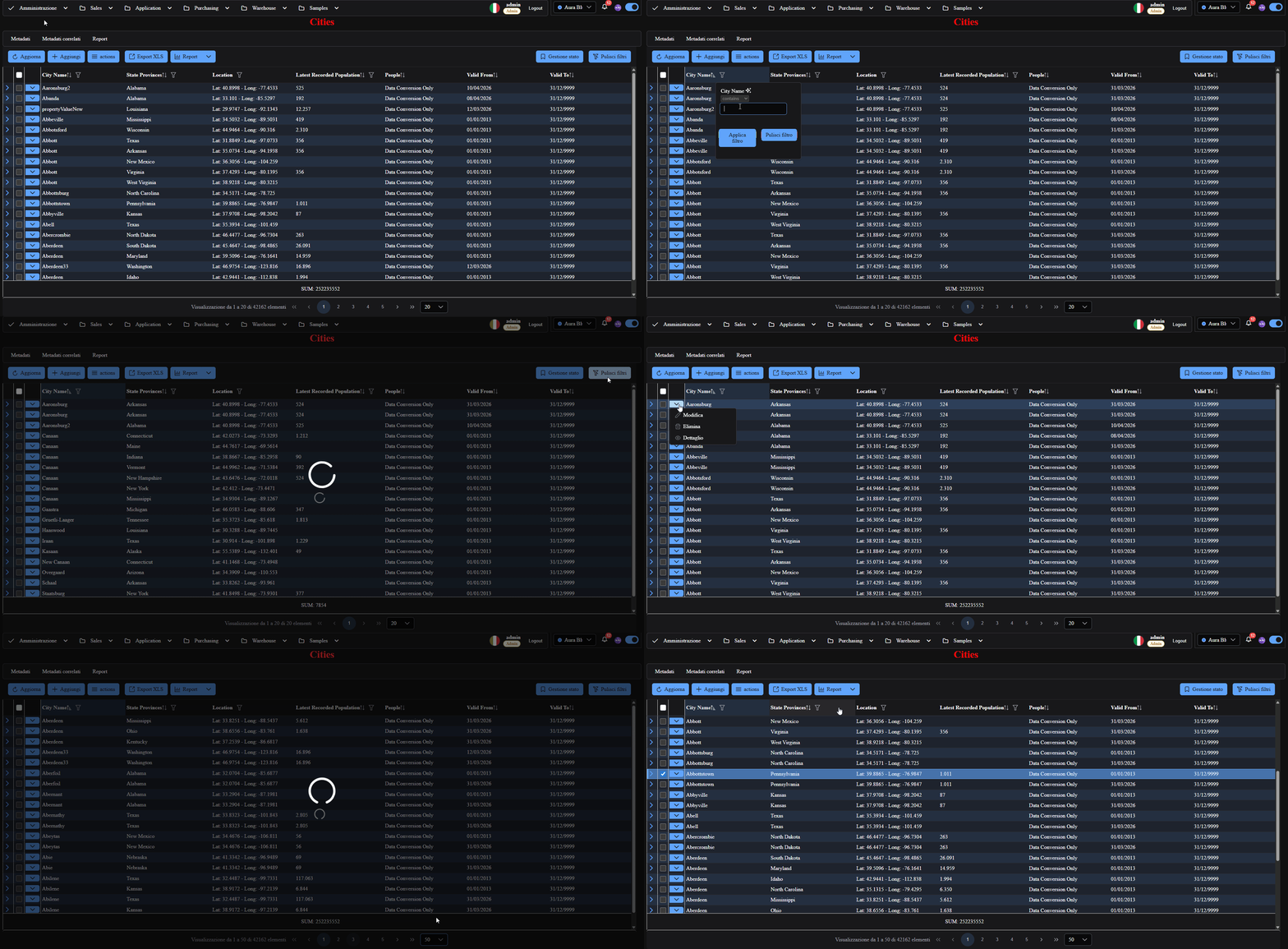
Main component for tabular lists with filters, sorting, server-side paging, and row actions.
Use Cases
- Enterprise tabular CRUD.
- Operational reports with multi-column filters.
- Very large datasets with
cursorMode.
What the toolbar shows by default
When you open a freshly scaffolded route, the caption bar sits above the grid. On the left:
| Button | When it appears |
|---|---|
| Refresh | always, unless md_hide_refresh |
| Add | with md_insertable |
| Actions | if the table has custom actions |
| Import / Export | always; the import branch only with md_importable |
| Reports | if at least one report is bound to the route |
| Save changes / Discard changes | only with md_inline_cell_edit and md_batch_save |
On the right: Manage state (preceded by the saved-states dropdown, when there are any),
Clear filters when filters live on the columns, and Performance if the inspector is
enabled on the route.
> The captions quoted further down this page are not on that screen, and that is not a
> defect: the export/import ones (Continue in background, Cancel task, *Stop and download
> partial, Cancel import (rollback), Stop and commit partial*) live in the progress dialog,
> which only exists while an export or import is running; Save changes and Discard changes
> only appear with the two flags above. They belong to moments other than first opening the
> list.
Screenshot Reference (User Manual)
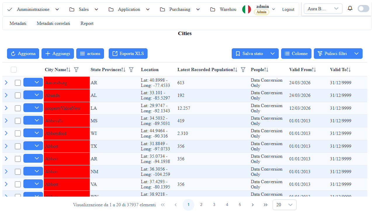
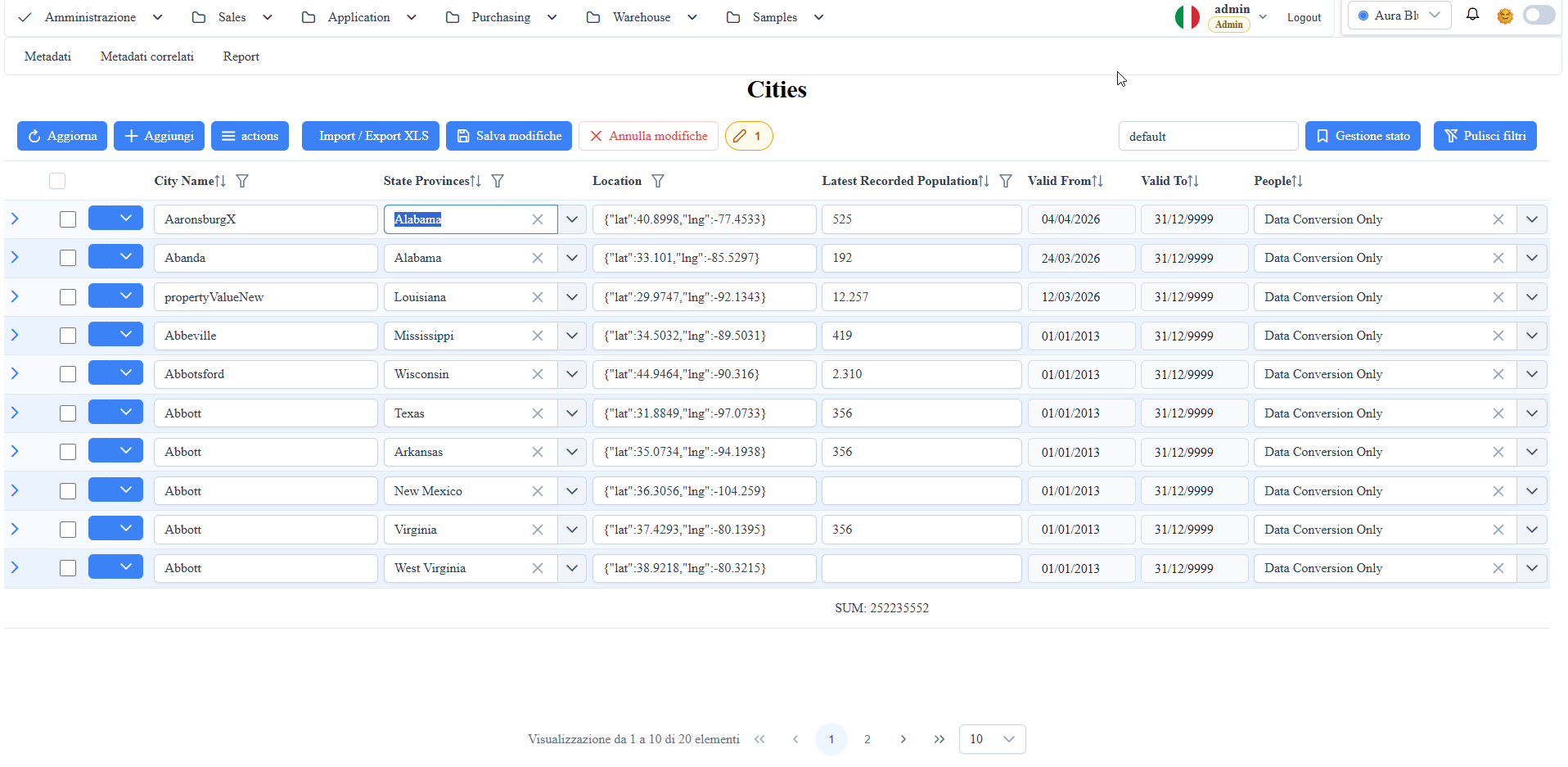
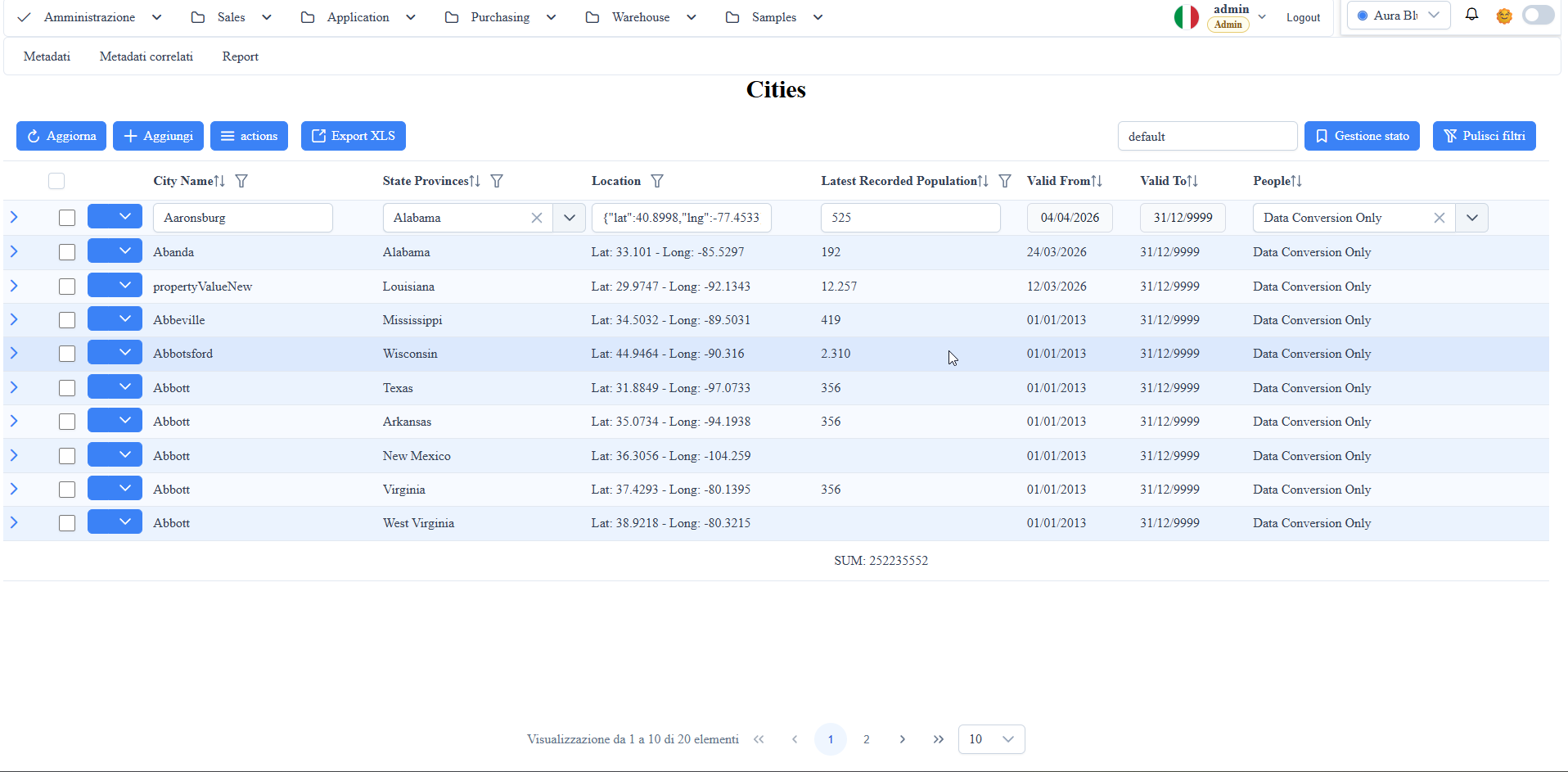
manual__grid__01.png:inline cell editmode in list-grid.manual__grid__02.png:inline edit(row-level) mode in list-grid.
Inline Editing Metadata
Configuration in the table metadata md_props_bag:
md_inline_edit
- Enables inline row editing in list-grid (editable cells in row context, without opening a popup).
- Useful when you want to maintain the table UX with quick editing per record.
md_inline_cell_edit
- Enables "cell-by-cell" inline editing (focus on the individual cell).
- Note: in legacy configurations it may appear as md_inline_cell_editing; the runtime behavior is the same.
- Runtime promotion: when md_inline_cell_edit is true, the component forces
md_inline_edit = true at runtime regardless of the DB value.
Both UX modes need the action column visible, so they are mutually
non-exclusive at the rendering level.
md_batch_save
- Enables batch saving of pending changes (Save changes / Cancel changes).
- When used with inline-cell, changes remain pending until explicit save.
- Prerequisite: md_batch_save takes effect only if md_inline_cell_edit is true.
With md_inline_cell_edit:false the flag is ignored at runtime and the
"Save changes / Cancel changes" buttons are not rendered.
Valid Combinations
md_inline_edit | md_inline_cell_edit | md_batch_save | Runtime Result |
|---|---|---|---|
true | false | any | Row-level inline edit with pencil. md_batch_save ignored. |
false | true | false | Cell-by-cell autosave on blur. md_inline_edit forced to true at runtime. |
false | true | true | Cell-by-cell with pending buffer + Save / Cancel changes toolbar. |
false | false | any | No inline editing. md_batch_save ignored. |
Row-level inline edit example:
{
  "md_inline_edit": true,
  "md_inline_cell_edit": false,
  "md_batch_save": false
}
Cell-by-cell with batch save example:
{
  "md_inline_edit": false,
  "md_inline_cell_edit": true,
  "md_batch_save": true
}
Toolbar Export/Import
- Export XLS:
- Shows a progress dialog with real-time percentage;
- Actions: Continue in background, Cancel task, Stop and download partial;
- In background creates a notification with progress; click reopens the dialog.
- If the server is already running maxConcurrentExports exports, the export waits in a queue: dialog and notification show "Queued: position N" and it starts by itself as soon as a slot frees up (it can be cancelled while waiting too);
- SQL Server: if the data database has ALLOW_SNAPSHOT_ISOLATION ON, the export reads under snapshot isolation and does not block writes on the table while it writes the file (without it, a long export holds its read locks and inserts/updates on the same table wait until it ends). Enable it once on the database (ALTER DATABASE [<data db>] SET ALLOW_SNAPSHOT_ISOLATION ON); it does not change how other reads behave, and it works alongside READ_COMMITTED_SNAPSHOT ON. The tutorial database has READ_COMMITTED_SNAPSHOT ON;
- Import XLS/XLSX (if
md_importable = true):
- Progress dialog after confirmation;
- Actions: Continue in background, Cancel import (rollback), Stop and partial commit;
- At the end of import creates a summary notification that navigates to the route.
Metadata Config
Key settings in md_props_bag and column metadata.
{
  "serverProperties": {
    "queryOptimization": {
      "enabled": true,
      "countPolicy": "cursor",
      "sqlServerHint": "none"
    }
md_props_bag: toolbar
Opt-in flags that hide blocks of the list-grid toolbar (caption-bar). All under md_props_bag.toolbar.* (parsed at runtime as tableMetadata.extraProps.toolbar).
{
  "toolbar": {
    "hideManageState": true,
    "hideBatchActions": true
  }
}hideManageState(boolean, defaultfalse): hides in the caption-right the "Manage state" button (bookmark icon) + the saved-states<select>. Useful for hardcoded / demo routes where the saved-state feature (persistence peruser_id+ route viaMetaService) doesn't make sense — e.g. Pattern 3 pure OData without registered route metadata.hideBatchActions(boolean, defaultfalse): hides in the caption-left the "Save changes" (pi-save) + "Discard changes" (pi-times) buttons + the changes count indicator (grid-changes-indicator, pencil badge + count). Generated by the framework whenmd_inline_cell_editing+md_batch_saveare active. Designed for nested grids inside a parametric-dialog: the parent's save/cancel persists master + rows in one shot via the framework batch save, and the duplicate buttons on the nested grid confuse the UX.
Example nested rows in custom edit-form (runtime patch):
this.righeDs.metaInfo.tableMetadata.extraProps = Object.assign(
  this.righeDs.metaInfo.tableMetadata.extraProps || {},
  { toolbar: { hideManageState: true, hideBatchActions: true } }
) as any;
TS type in `metadati_tabella.ts` (extraProps.toolbar property). The flags do NOT disable the underlying md_batch_save logic (changes are still tracked); they only remove the toolbar UI — the actual save flows through the parent.
md_props_bag: archetypes.list
The component reads md_props_bag.archetypes.list.
{
  "archetypes": {
    "list": {
      "proportionalColwidth": true,
      "advancedFilter": false,
      "virtualize": {
        "enabled": true,
proportionalColwidth:- type: boolean (with tolerant parser)
- accepted values:
true,false,1,0,"true","false","1","0" - runtime default:
truewhen absent or empty - effect: distributes column widths proportionally (instead of px) when no user-persisted widths exist.
virtualize:- type:
booleanorobject - accepted values:
true/false,1/0,"true"/"false","1"/"0"- object with
enabled(optional) anditemSize(optional) - runtime default: disabled (
false) when absent enabled:- default:
trueif thevirtualizenode is an object withoutenabled, otherwise tolerant parser - effect: enables
virtualScrollonp-table itemSize:- default:
44 - effect: sets
virtualScrollItemSize(virtual row height in px)
advancedFilter:- type: boolean (with tolerant parser)
- runtime default:
false - effect:
- when
true, the grid hides column filter icons (p-columnFilter) and uses thewuic-filter-barabove the table (atdata-repeater/bounded-repeaterlevel) to apply filters.
Operational note:
- The
md_props_bagsuggest in the metadata editor also exposes the checkablearchetypes.list.advancedFilternode.
Paging: md_pagesize and md_page_size_choice
The grid uses md_pagesize as the default page size and md_page_size_choice as the list of selectable values in the paginator.
Runtime rules:
- If
md_pagesizeis greater than the maximum value present inmd_page_size_choice, the framework automatically addsmd_pagesizeto the options list; - The list is normalized (valid numbers, deduplication, ascending sort).
Example:
md_pagesize = 200md_page_size_choice = "10,25,50,100"- runtime result:
10,25,50,100,200
Forced Virtualization on High Page Size
When the user selects in the paginator a pageSize >= 1000:
- virtualization is automatically forced even if
md_props_bag.archetypes.list.virtualizeis absent or disabled; virtualScrollItemSizeis forced to the default value44.
This behavior protects the table rendering on very large pages.
Events and Subscriptions (Host)
wuic-list-grid exposes runtime events useful for intercepting the render cycle and p-table callbacks on the host project side.
Available events:
onAfterRender: emitted at the end of grid data binding (rows,totalRecords,metaInfo,datasource).onBeforeRowRender: emitted before the logical rendering of a single row; supports cancel viaevent.cancelRender().onAfterRowRender: emitted after the logical rendering of a single row.onPaging: emitted on paging events (p-table onPage).onSorting: emitted on sorting events (p-table onSort).onFiltering: emitted on filtering events (p-table onFilter).onPTableSelectionChange: emitted on row selection change.onPTableRowExpand: emitted on row expand.onPTableRowCollapse: emitted on row collapse.onPTableColumnResize: emitted on column resize.onPTableColumnReorder: emitted on column reorder.
Example 1: Direct Binding in Template
<wuic-list-grid
  [hardcodedDatasource]="citiesDs"
  (onAfterRender)="handleAfterRender($event)"
  (onBeforeRowRender)="handleBeforeRowRender($event)"
  (onAfterRowRender)="handleAfterRowRender($event)"
  (onPaging)="handlePaging($event)"
  (onSorting)="handleSorting($event)"
Example 2: Subscribe via ViewChild
import { AfterViewInit, OnDestroy, ViewChild } from '@angular/core';
import { Subscription } from 'rxjs';
import {
  ListGridAfterRenderEvent,
  ListGridAfterRowRenderEvent,
  ListGridBeforeRowRenderEvent,
  ListGridComponent
rowCustomSelect — actual signature (gotcha)
<wuic-list-grid> accepts a [rowCustomSelect] input to hook into row selection (opening a "pick a document" dialog, master-detail flow, etc.). The TypeScript signature declared in list-grid.component.ts:140 reads:
@Input() rowCustomSelect: (rowData: any, $event: any, dt: Table) => void;However at runtime the callback is invoked with arguments reversed — the framework calls rowCustomSelect($event, rowData, dt) (see dynamic-template.component.ts:447 and dynamic-card-template.component.ts:205).
Symptom of wrong arg order: rowData?.id is undefined → early-return guard in your handler → the callback returns silently and your dialog/action never fires. No console error.
Correct form (matches runtime invocation):
onRowSelected = (_event: any, rowData: any, _dt: any): void => {
  // rowData is the record provided by list-grid
  this.handleSelection(rowData);
};
Template usage:
<wuic-data-source #ds [hardcodedRoute]="'preventivi'" [autoload]="true"></wuic-data-source>
<wuic-list-grid [hardcodedDatasource]="ds" [rowCustomSelect]="onRowSelected"></wuic-list-grid>
> Note: tests in designer.component.spec.ts (e.g. line 512) invoke the callback with ({currentTarget: rowCell}, {id: 42}, null), confirming the ($event, rowData, dt) order. If the framework eventually aligns the declared signature, this page will be updated as well.
Screenshot