A complaint that comes up every time we demo WUIC to someone with a CRM or back-office app: "this is all very nice on a 27-inch monitor, but our reps live on iPads in the field, and your default list view is unreadable on a phone."
It used to be a fair complaint. The fix wasn't dramatic — a modest diff across two components, some SCSS, and one small service. But what we got out of it is zero per-screen configuration for mobile: every existing scaffolded route automatically gets a card-stack layout on phones and a vertically stacked edit form, and the dev doesn't write a single media query.
This post walks through how it's wired, and where it draws the line.
The default behavior
Open any list page on the public demo at 1920×1080 and you see a <p-table> from PrimeNG: dense, columnar, scrollable, with sort/filter/group headers. The classic enterprise table.
Now resize the window below 768px (or open it on a phone). The table layout disappears, and in its place is a vertical stack of cards — one per record. Each card shows the action buttons on top and a label/value row for every column that's visible in the list (the same mc_hide_in_list rules the desktop grid uses), with the same cell formatting: lookups resolve, uploads render thumbnails, colors render swatches.
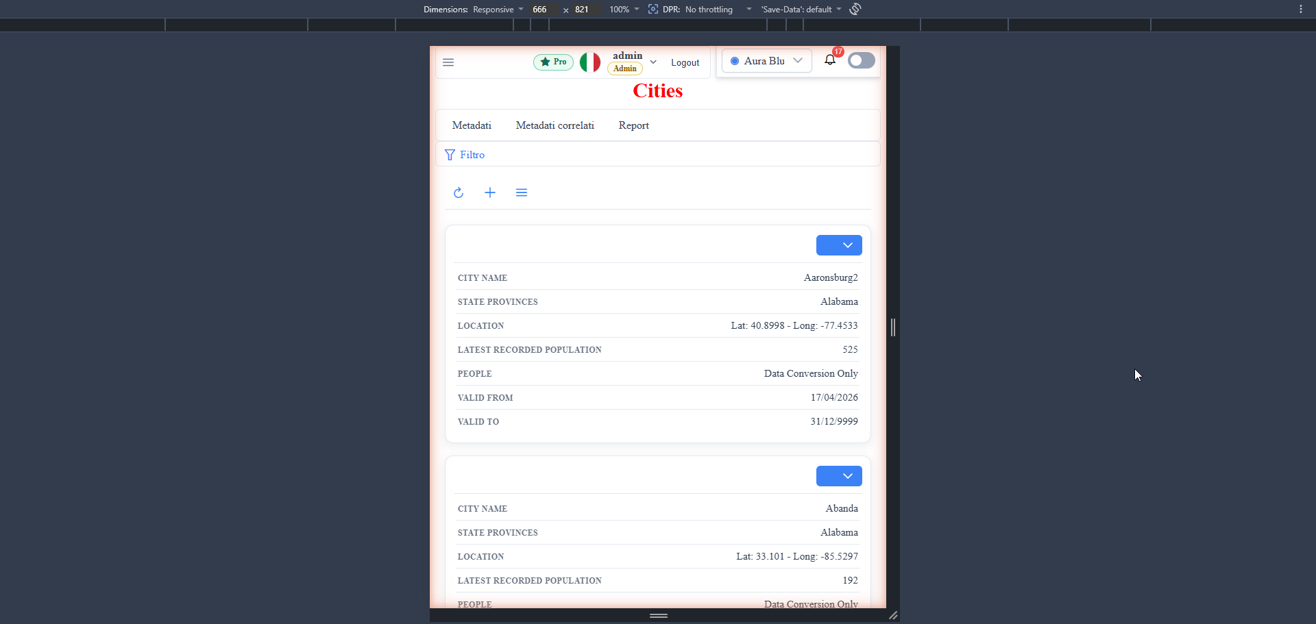
No metadata change. No if (mobile) { ... } in your app code. Same route, same datasource, same metadata — the framework swaps the row template.
The edit form (<wuic-parametric-dialog>) reflows too: multi-column layouts collapse to a single column, fields go full-width, the tab list becomes horizontally scrollable, and the toolbar compresses.
Where the swap lives
There are two distinct mechanisms because they solve different problems.
List-grid: runtime row-template swap (TS)
The list-grid renders one PrimeNG <p-table> on both viewports — but the row template, which is compiled at runtime anyway (that's how per-route custom row templates work), is different on mobile:
// list-grid.component.ts (excerpt)
private getEffectiveGridRowTemplate(metaInfo: MetaInfo): string {
  // Mobile: the row template emits a single <td colspan> with a
  // card-style layout — same <p-table>, same JIT compile pipeline.
  if (this.deviceAwareness?.isMobile) {
    return this.buildMobileCardAsRowTemplate(metaInfo?.columnMetadata || []);
  }

  const customRowTemplate = String(metaInfo?.tableMetadata?.md_rowTemplate || '').trim();
  if (customRowTemplate) {
    return customRowTemplate;
  }
  // ... host override, then library default
}
On mobile the compiled row is a single <td colspan> containing the card markup; a wuic-list-grid-mobile CSS class plus a media query hide the <thead> and turn <tr>/<td> into display: block, freeing the DOM from table semantics. The template string is compiled into a real component class at runtime via Angular's ɵcompileComponent — the same pipeline that powers custom row templates on desktop.
The viewport detection is a singleton service:
@Injectable({ providedIn: 'root' })
export class DeviceAwarenessService {
  readonly isMobile$: Observable<boolean> =
    this.isMobileSubject.pipe(distinctUntilChanged());

  constructor() {
    const breakpointPx = this.resolveBreakpointPx(); // widgetDefinition, default 768
    this.mediaQueryList = window.matchMedia(`(max-width: ${breakpointPx}px)`);
    // ...listener pushes matches into the BehaviorSubject
  }
}
When the viewport crosses the breakpoint, the observable emits, the grid recompiles its row template, and the same <p-table> re-renders as cards. No reload, no double-fetch — the data is already in the component's records array.
Customizing the card: mobileCardTemplate
The default card is built for you — an action-button row on top, then one label/value row per visible column, reusing the exact same cell renderers as the desktop grid (a lookup link, an image thumbnail, a colour swatch all render the way they do in a table cell). For most back-office screens that's the whole job.
When you want a different card layout, the public WidgetDefinition API exposes a mobileCardTemplate hook — an Angular template string that replaces the card body. It's compiled at runtime through the same ɵcompileComponent pipeline as the row template and injected into the card cell, so inside it you have the grid's scope: rowData for the current record, the columns list, metaInfo, and the same helper pipes the default uses (formatGridViewValue, visibleFieldList, the cell-class helpers). One thing to know up front: it's set at the host level, so it applies to every grid in the app — it's a global card style, not a per-route override.
The full list of variables available in the template's scope is in the responsive-layout docs.
Edit-form: CSS-only reflow (SCSS)
The edit form is the opposite call. <wuic-parametric-dialog> already builds a flexbox row layout in plain HTML — there's no library DOM fighting us, and the mobile layout wants the same DOM, just stacked. So no template swap; a media query does it:
// parametric-dialog.component.scss
@media (max-width: 768px) {
  .row {
    display: flex;
    flex-direction: column;
    flex-wrap: nowrap;   // default .row wraps → phantom second column
    gap: 12px;
  }

  :host ::ng-deep .data-field-wrapper {
    width: 100% !important;
    max-width: none !important;
  }
  :host ::ng-deep .data-field-field {
    width: 100% !important;
  }
}
The !important is defensive: field widths come from mc_ui_size_width per-column (a designer-saved value rendered as inline styles) and the media query has to win on small screens. The same defensive rule lives in field-editor.component.scss so it applies whether the field is hosted directly or inside a wrapper.
Total mobile-specific code for the edit form: a few dozen lines of SCSS (stacking, tab-list scroll, compact toolbar). No TypeScript.
That covers the automatic reflow. When a screen needs a genuinely bespoke form — grouped panels, a custom header, fields laid out around an image — the edit dialog takes a full custom template too: set md_edit_template on the route and <wuic-parametric-dialog> renders your Angular form markup instead of the auto-generated field layout, compiled at runtime. Unlike the list's mobileCardTemplate (which is host-wide), this one is per-route, so each screen opts in independently; md_detail_template does the same for the read-only detail view. You own that markup — including how it reflows on a phone — so the automatic stacking above applies to the default layout, not to a template you hand-write.
Why the asymmetry? Because the list needs different DOM per viewport — cells versus cards — which is a template problem, while the form needs the same DOM in a different flow — which is a CSS problem. The right answer was different for each.
What we don't try to handle automatically
We've seen "responsive mode" sold as a magic checkbox, and we don't want to over-promise. Here's the explicit list of what stays manual:
- Per-column priority on the card. The default card shows every column that's visible in the list. If you want "name + city + last_seen on the card, hide the rest", you hide columns via the existing
mc_hide_in_listrules and condition system. We don't have a dedicatedmobile_visibleflag — adding a second flag for every responsive concern is how metadata schemas balloon. - Inline editing on mobile. Deliberately unsupported: tapping a card opens the edit form. Cell-by-cell editing on a 380px viewport is a UX trap we chose not to fall into.
- Filter bar. On desktop it's an inline collapsible panel above the list. On mobile that's unusable (it ate most of the viewport in early prototypes) — so below the breakpoint the same content opens as a full-screen overlay with its own header and close button, and the list underneath stays intact. That behavior is hard-coded in the filter-bar component, not metadata; if you don't like it, you override the component.
- Designer surfaces. Drag-and-drop designers (dashboard, report, workflow) are desktop tools; we don't attempt to make them mobile-friendly. Read-mode dashboards reflow fine.
- Custom Angular components. If you wrote a custom widget (a colour picker, a map, a charting widget) and didn't think about mobile, it'll look bad on mobile. The framework doesn't know how to reflow third-party components — that's on you.
DeviceAwarenessService.isMobile$is public precisely so your components can make the same call the grid makes.
The breakpoint
The default is 768px, matching the Bootstrap-style convention (and the framework's own @media rules). Override per app at bootstrap — widgetDefinition is a static:
// main.ts (or an APP_INITIALIZER)
import { MetadataProviderService } from 'wuic-framework-lib';
import { environment } from './environments/environment';

MetadataProviderService.widgetDefinition.mobileBreakpointPx =
  environment.mobileBreakpointPx ?? 768;
The breakpoint is read once, at DeviceAwarenessService construction — changing it later means re-bootstrapping the app, which in practice nobody needs. The real use cases are static per app: "this app is tablet-first, raise it to 1024" or "this app runs on warehouse scanners, lower it to 600".
Performance corner
Two things worth mentioning, both consequences of the unification:
Virtualization comes for free. Card stacks can have hundreds of rows, and the first prototype rendered its separate card list entirely into the DOM — fine for 50 cards, smelly for 500. Since mobile now renders through the same <p-table>, the grid's virtual scrolling — gated by the same isListVirtualizationEnabled() switch as desktop — applies to the cards too. One flag, both viewports.
No churn on resize. isMobile$ goes through distinctUntilChanged, so the row template recompiles only on the actual boolean transition across the breakpoint, not on every resize tick.
When it's not enough
If you need a layout that's neither a desktop table nor a vertical card stack — say, a kanban board on phone, or a horizontally-paginated card carousel — the right answer is a different archetype, not a flag. kanban and carousel are archetypes in the framework's widget definition (alongside scheduler, map, tree and the rest), and each renders on both viewports with its own behavior.
Mobile auto-layout in WUIC handles the transactional archetypes (list + edit form), which is 80% of an enterprise back-office. The 20% — kanban, scheduler, map — has its own per-archetype responsive story.
Try it
The public demo runs in any browser at any width. Open DevTools, switch to a phone profile, navigate to any list — you'll see the card swap live. The credentials are on the sandbox landing page; login takes 2 seconds.
The full list of files involved (for the curious): device-awareness.service.ts, list-grid.component.{html,ts,scss}, filter-bar.component.{html,ts}, parametric-dialog.component.scss, field-editor.component.scss — plus the widgetDefinition.mobileBreakpointPx hook for app-side override.
The counterpart to auto-layout on the read side is the drag-and-drop dashboard designer — UI that writes JSON metadata, and how designer-saved boards survive runtime upgrades. And if you're wondering how those routes got scaffolded in the first place, start here.